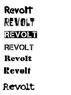
I decided to begin my planning for my music magazine by working on the title, i came up with the name 'Revolt' as it seemed both catchy and would suit its target audience.
I wanted a font that would both incorporate the Industrial style of modern music with the rebellious look,to appeal to a target audience of young adults.
Font 1: This font I decided was a good one, I liked the outline of the shape and the positioning of the text, however I decided that I wanted my title to have the appearance of texture, not just solid.
Font 2: This font contained the Texture i was looking for, however I did not like the positioning nor the shape of the text.
Font 3: I decided that this font appealed to me, the texture of the Font was the effect I was looking to include in my music magazine, the background being black I decided it could only be used on a music magazine of the same background cover, as I wouldnt want my title to be segregated from the rest of my front cover.
Font 4: This font was the same as font 3, but there was no background, and the text was black instead of white, I decided that this font would be fairly suitable for my purpose.
Font 5: This font used a character layout which I thought would go well in a music magazine, however the lack of texture led me against using it as a title font.
Font 6: This font both didnt appeal to me in texture nor layout, the font did not suit the text well, and I wouldnt like to use it as a title.
Font 7: This font suited my needs in layout, the almost Chemical look would assist towards the industrial look I was going for, however the lack of texture would again lead me to abandon using it as a title font, unless I discovered a suitible texture to apply to the font.
No comments:
Post a Comment